Volkswagen Certified Pre-Owned Website
What
Usability research and iterative design updates to improve conversion on VW Certified Pre-Owned site
When
Fall 2018
My Role
Research and product design
The Team
Jordan Kentris UX Director
Judith Majonis UX Researcher
Alice Pinto Project Manager
William Lee, Lead Developer
Molly Seewald Account Director
Challenge
The existing Certified Pre-Owned site was failing to meet KPIs for conversion. The project aims were to increase the percentage of users who clicked through to specific vehicle pages. A secondary goal was to better promote the value proposition of the benefits of buying Certified Pre-Owned.
Process
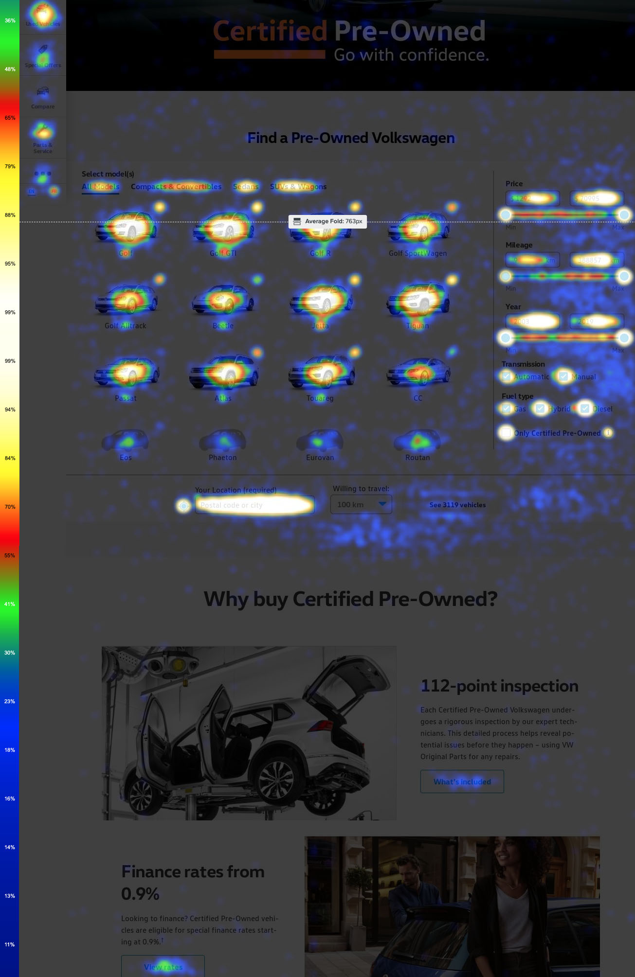
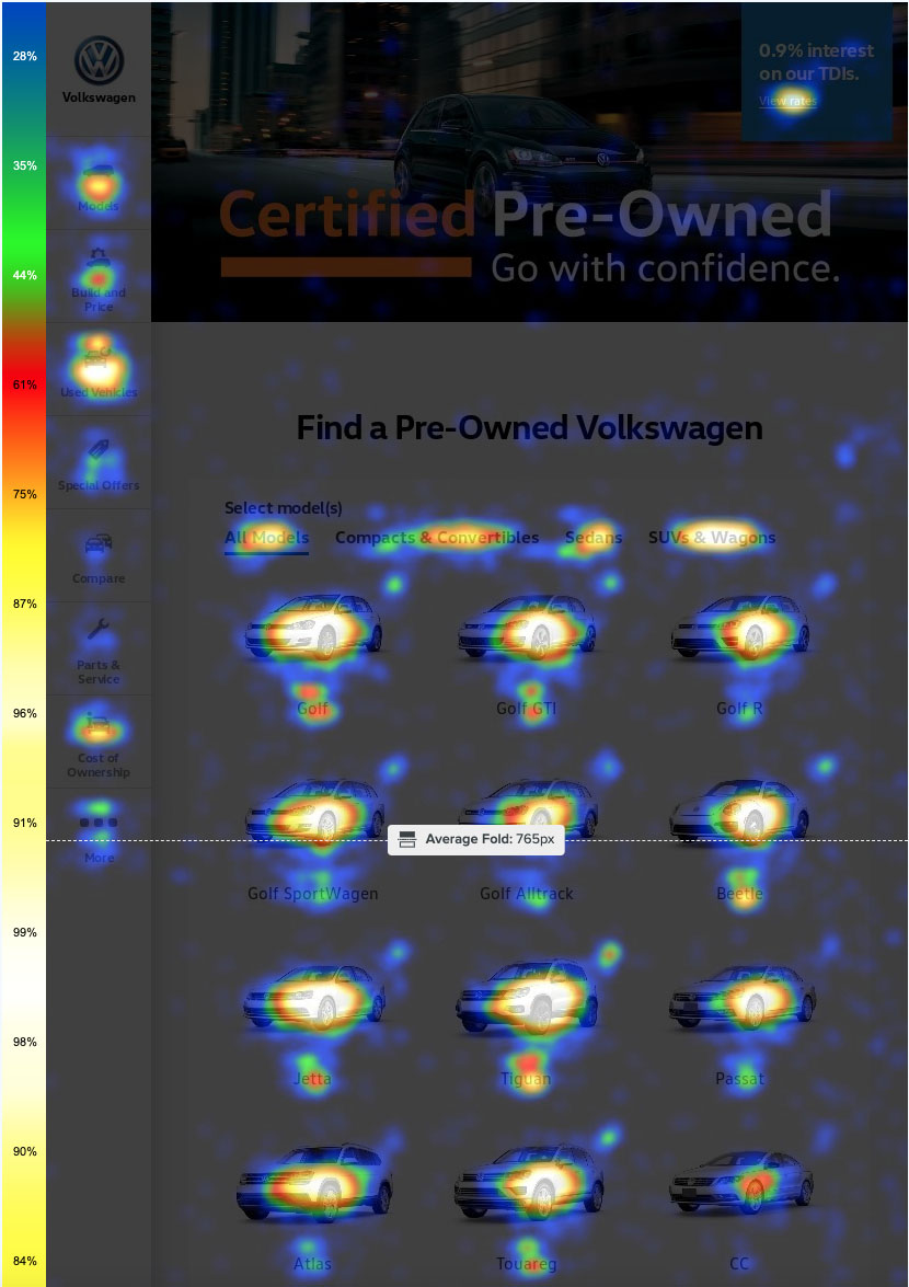
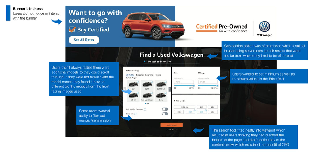
I familiarized myself with the site analytics to identify the more popular elements, and where the drop off was occurring, this was triangulated with data from Crazy Egg which showed where users were scrolling and clicking. I then carried out some usability testing and interview sessions to gain qualitative insights. Clear pain points could be identified - see images below for details. This knowledge enabled me to design new prototypes which addressed the issues, which were then validated through usability testing before development.
Outcome
Conversion rate surpassed the KPI metrics.
Usability testing of old version of the used car website
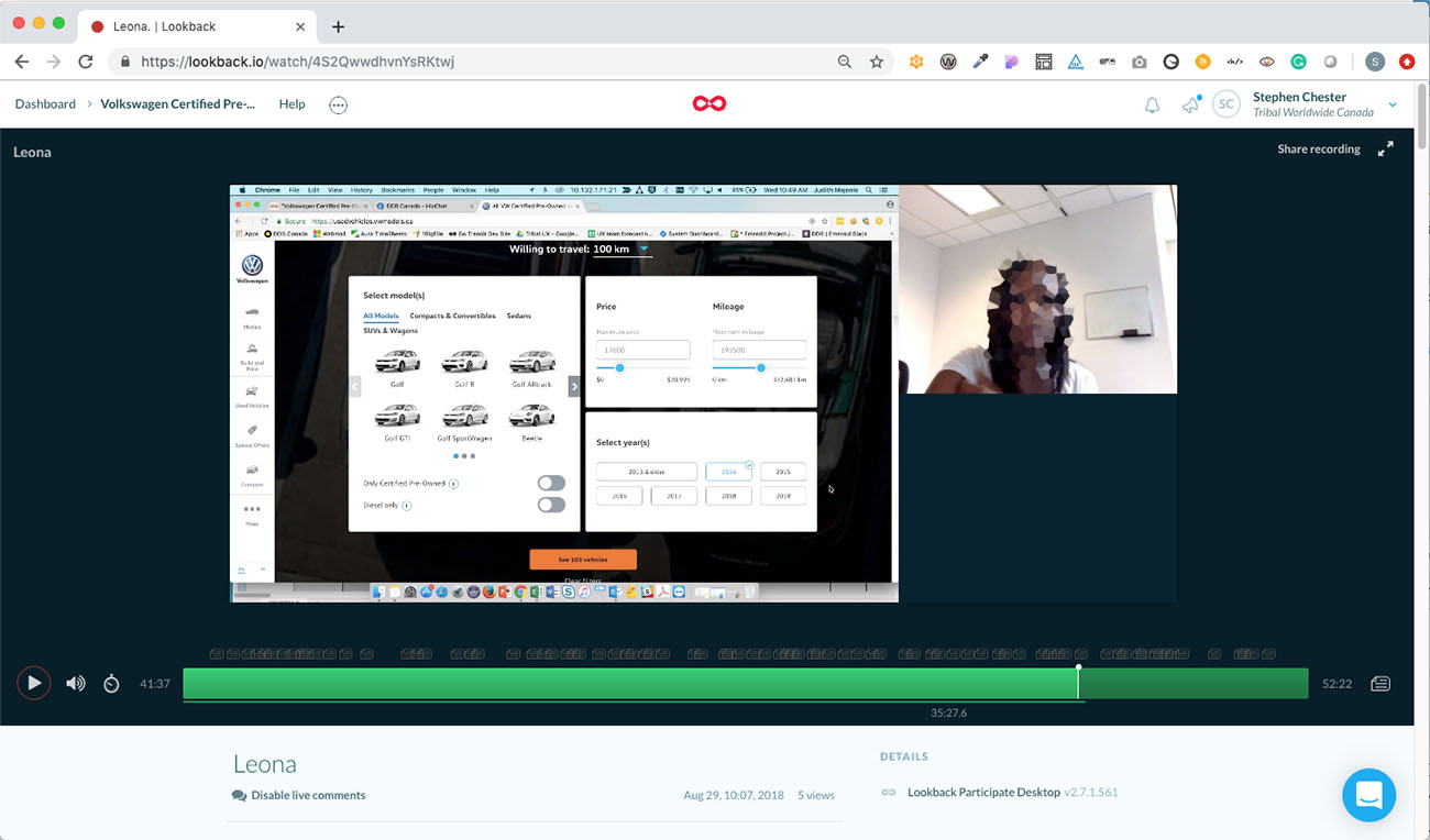
Findings from usability testing
I observed users experiencing the same frustrations with the site. I identified pain points and recommended solutions. A major issue was that nobody realized they could scroll down the page to learn more about the benefits of buying Certified Pre-Owned
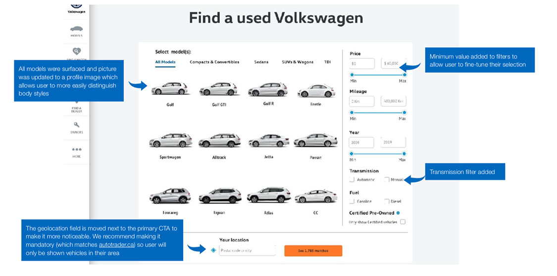
Interactive Prototype for new filter design
I addressed each of the usability issues identified in the old design and created an interactive prototype in Sketch and Invision, which was then shown to users to determine whether the problems had been solved.
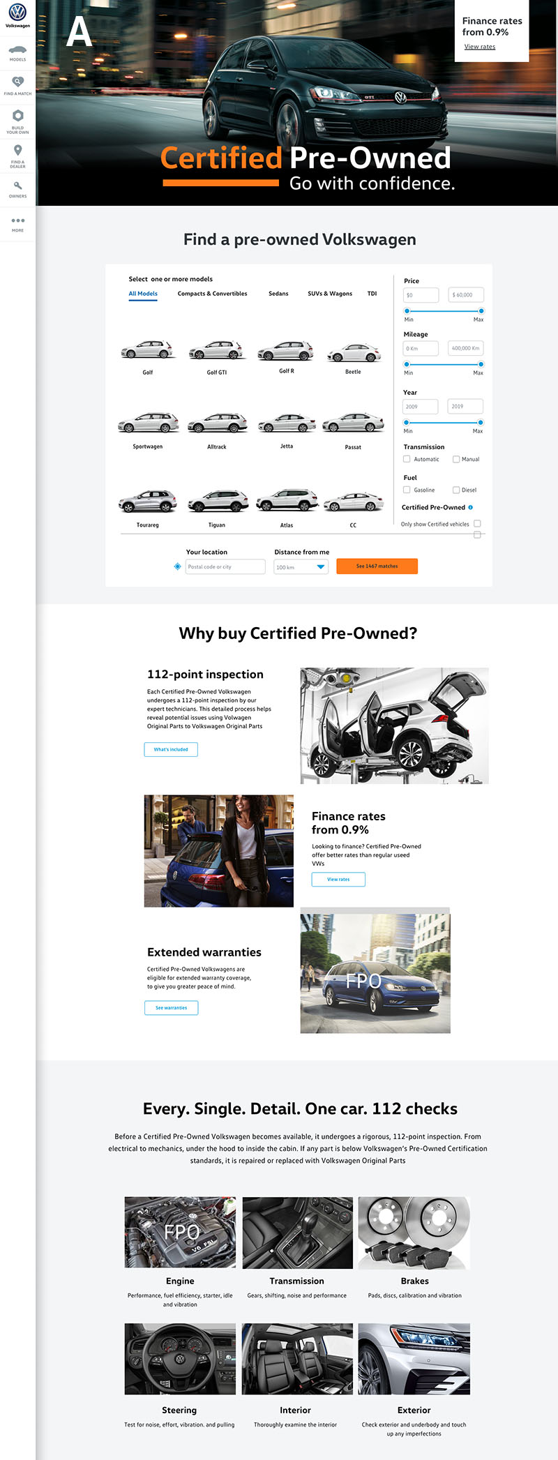
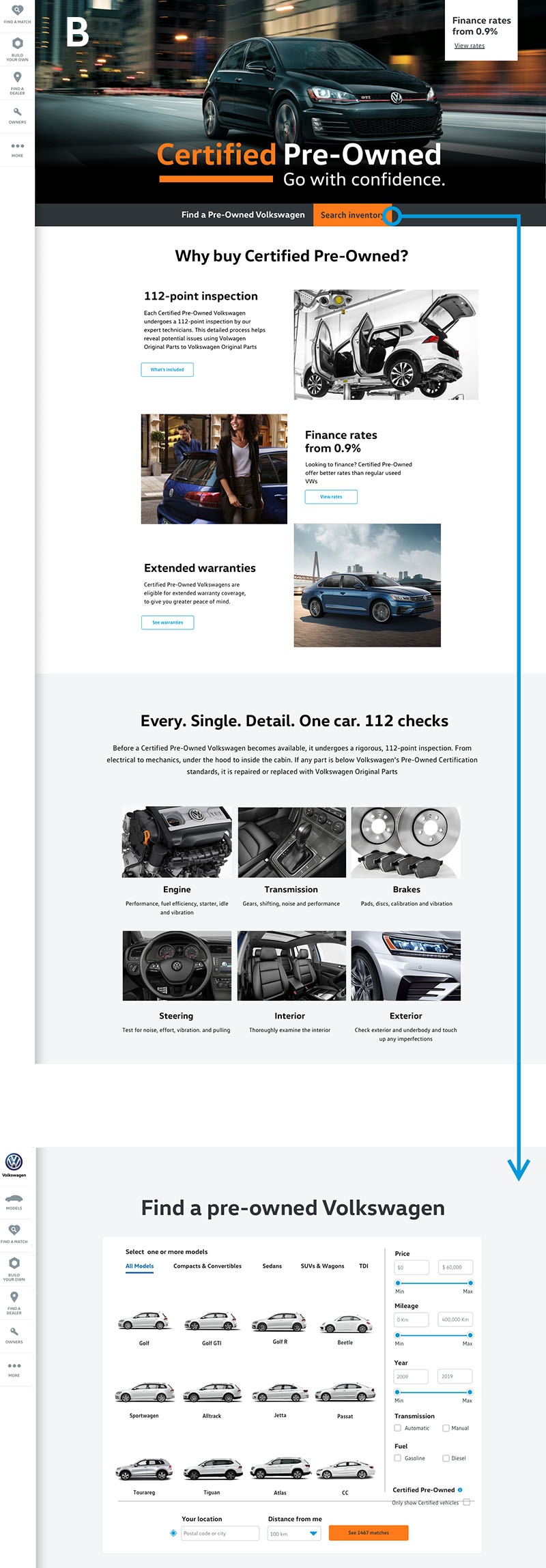
A/B Testing on live site
I was curious whether moving the vehicle selector to a separate page would encourage users to engage with the content explaining the value proposition of buying a certified car. I was concerned that it may have negatively impacted the number of vehicle searches so designed two versions that we could track over a month. Design A ended up with superior conversion metrics.
Ongoing user behaviour monitoring with Crazy Egg
We are still looking at ways of encouraging users to better engage with the content underneath the vehicle selection tool. Nevertheless, there is a 100% improvement over the previous design in which less than 10% of users scrolled past the selector
