
VW Online Build & Price Tool
What
Redesign the vw.ca tool which enables users to customize and calculate the price of a vehicle.
When
Summer 2018
My Role
UX research, strategy and product design lead
The Team
Jordan Kentris UX Director
Alice Pinto Project Manager
William Lee Lead Developer
Molly Seewald Account Director
Shane Sincich Business Analyst
Challenge
The existing build and price tool was not meeting expectations for task completion, with users dropping off before reaching the final pricing option screen. My brief was to reimagine the process and create a better experience.
Process
Recruit sample users who are currently considering buying a new vehicle, and are using online tools to conduct their research.
Identify best in class examples of pricing tools from both direct, and indirect competitors.
Carry out user interviews focusing on revealing user goals and mental models. The sessions also involved a usability test session, using both the existing VW build and price tool, and those of competitors.
Interview insights were synthesized to distill key user goals and create the following high-level guiding principles:
- Remove any ambiguity in users mind about which features are included with each model option.
- Be financially transparent, assuage users anxiety and suspicions by clearly explaining any additional fees and taxes.
- Empower the user by allowing them to immediately understand the impact of their customization choices on their chosen payment method.
- Allow users to easily update the payment frequency and length of the term at any point of the process.
The design phase was divided into five week-long design sprints.
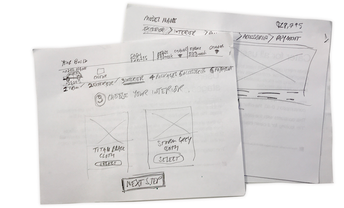
I started with rough exploratory sketches to generate multiple solutions, then identified what were the most successful elements. These were refined into high-fidelity designs using Sketch and Invision to create an interactive prototype.
Every Friday I showed the prototype to five users to gain feedback into how successfully the design served the user's goal achievement. Informed by these insights, I updated the designs.
Outcome
More than 50% increase in users clicking through to final payment calculator screen.
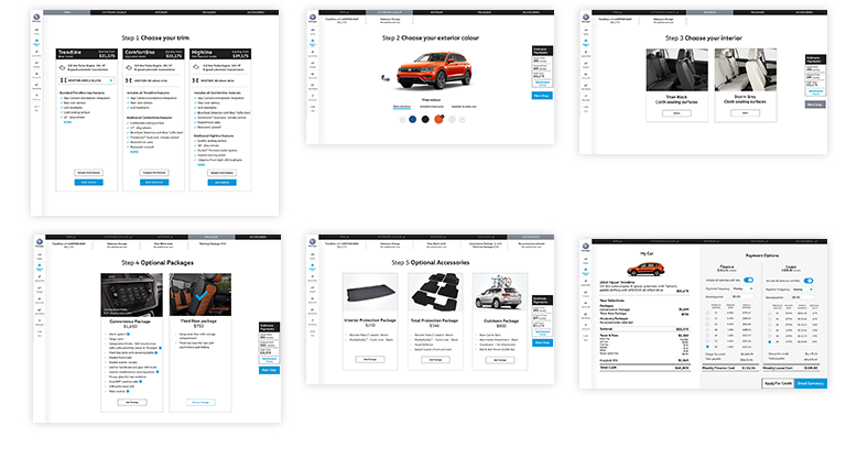
The design sprint process
Sprint 1
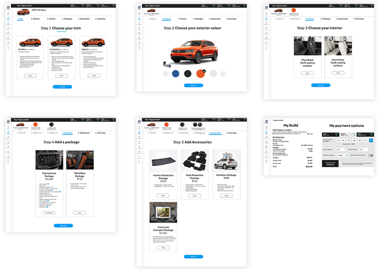
After identifying the strongest sketched solution, I designed a high fidelity interactive prototype in Sketch and Invision. At the end of each week, the prototype was tested by five users, whose recruitment profile indicated they were currently shopping for a new car.
Click screens for larger version
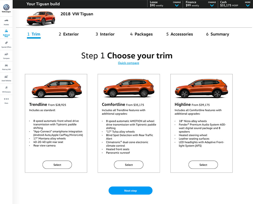
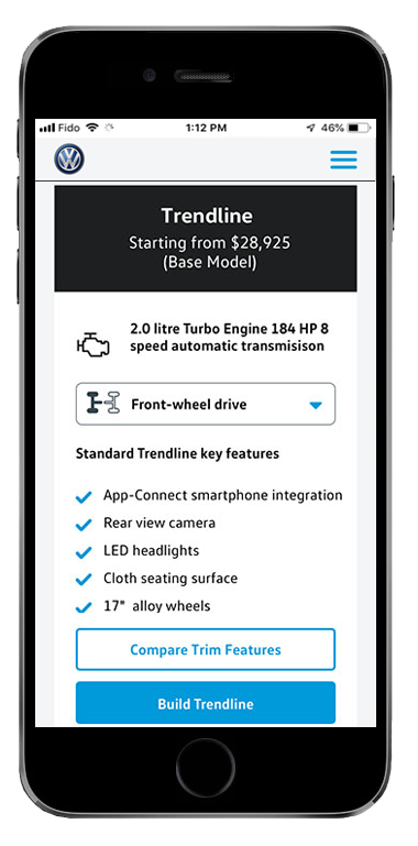
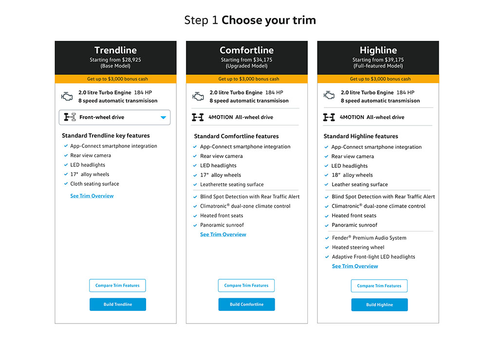
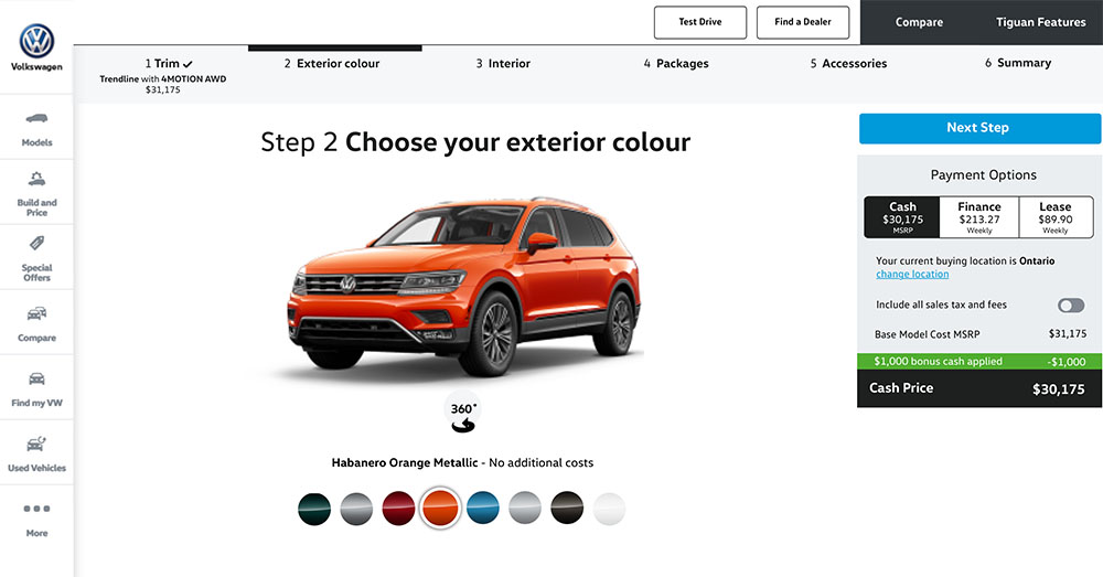
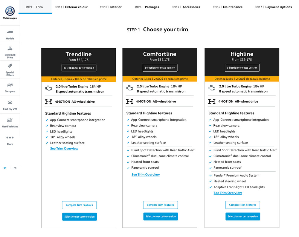
The user chooses the feature level of the vehicle.
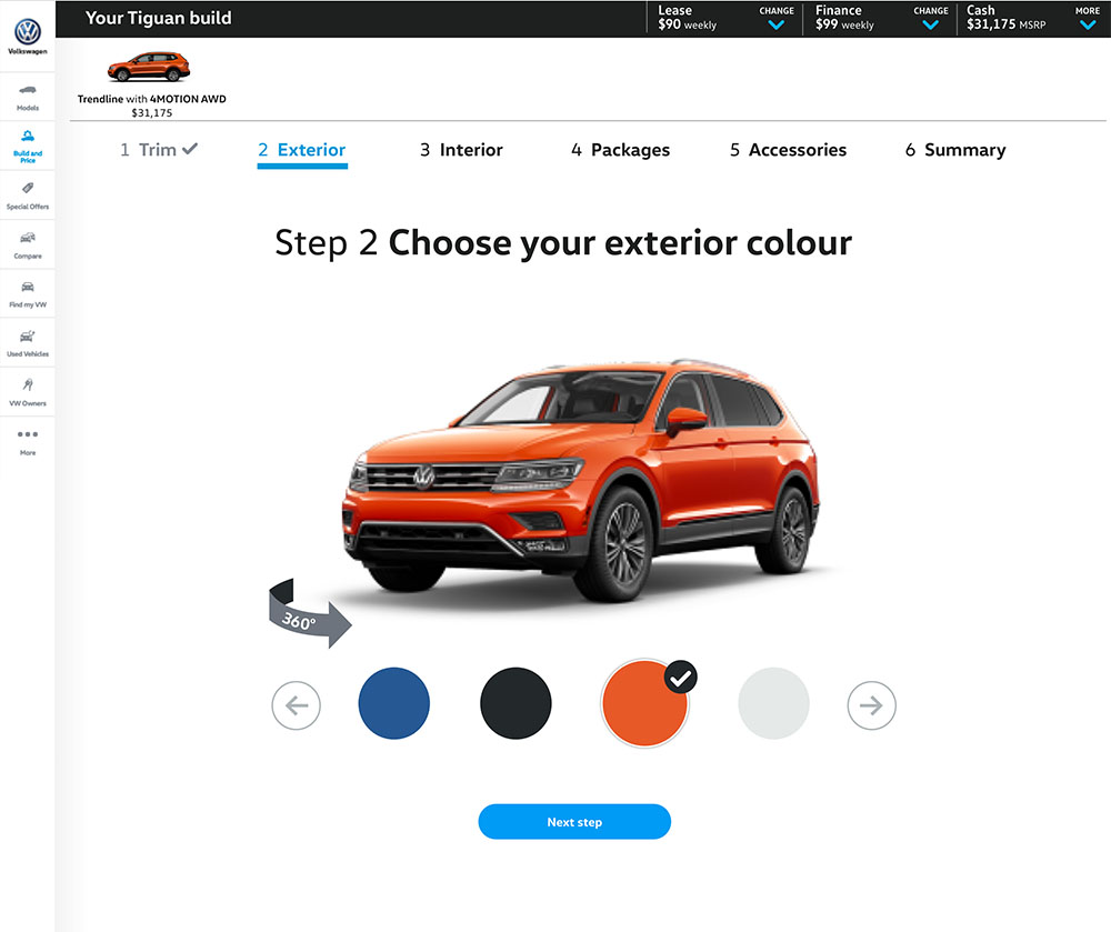
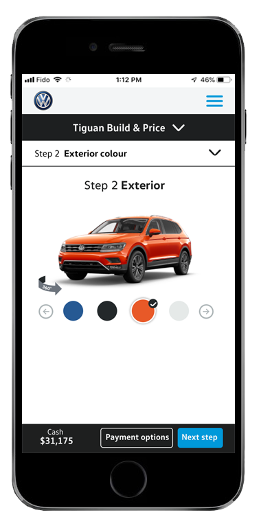
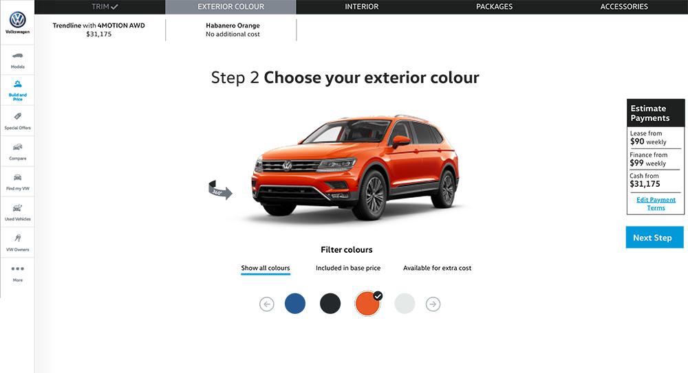
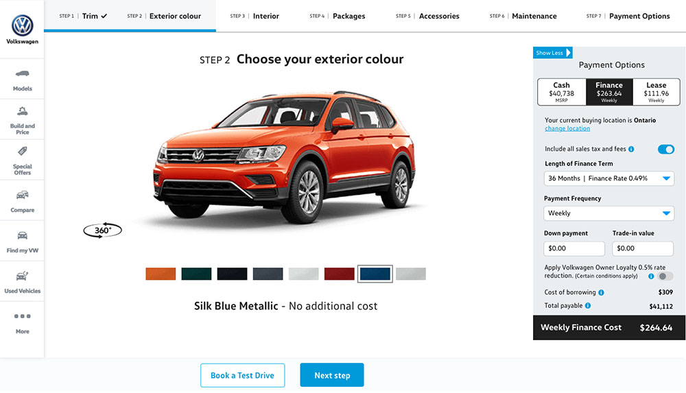
Colour options included at an early step as an opportunity to engage the user with easy, fun interaction.
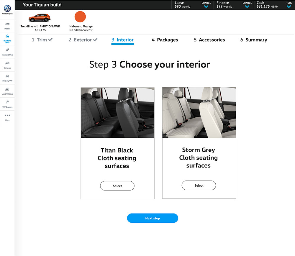
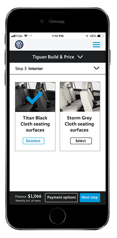
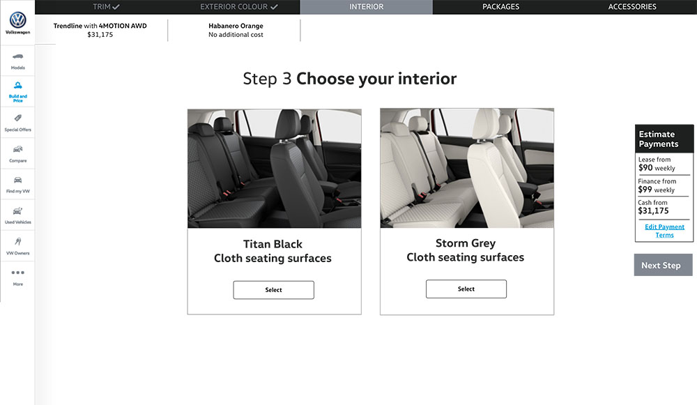
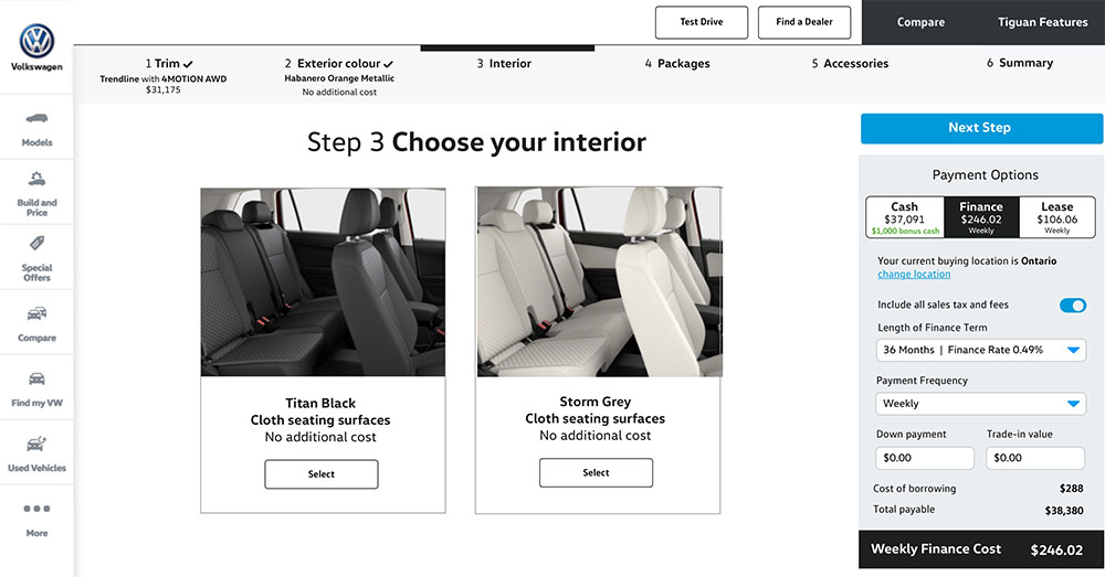
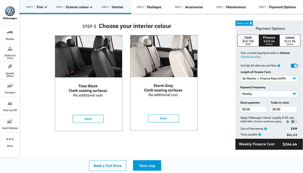
Select colour and material of the interior.
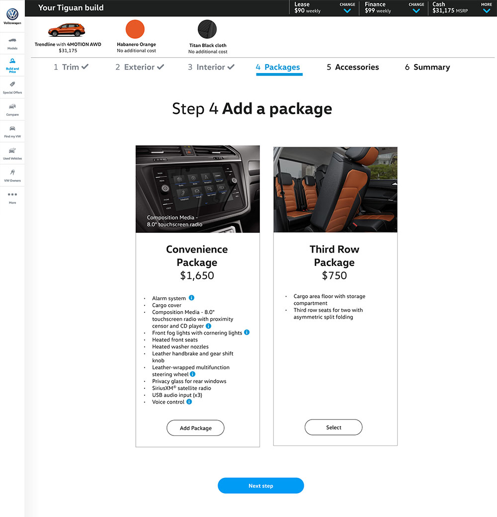
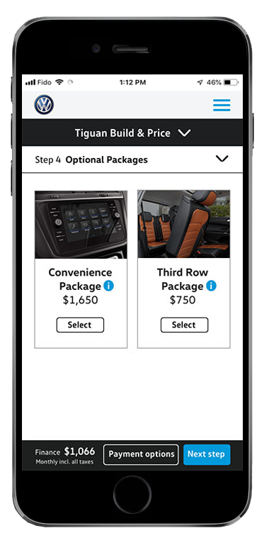
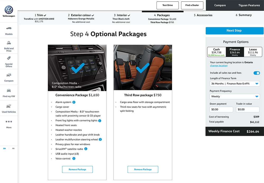
Cards detailing the additional optional packages.
I debated whether to include accessories as a step because prices vary between dealerships. However, research revealed there was a user appetite for customization.
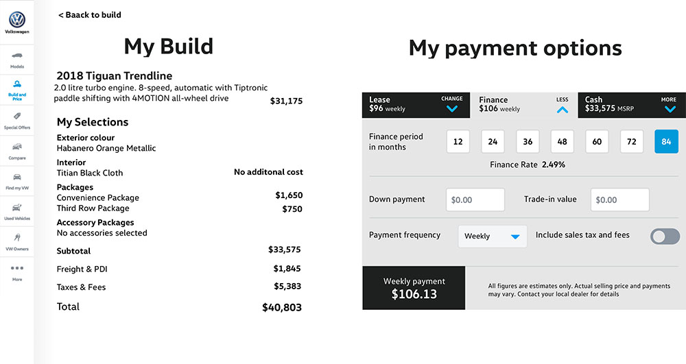
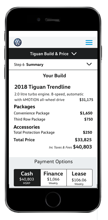
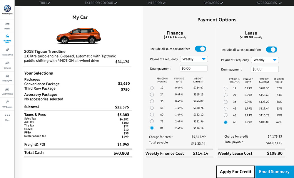
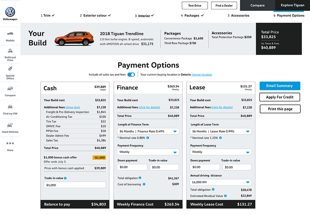
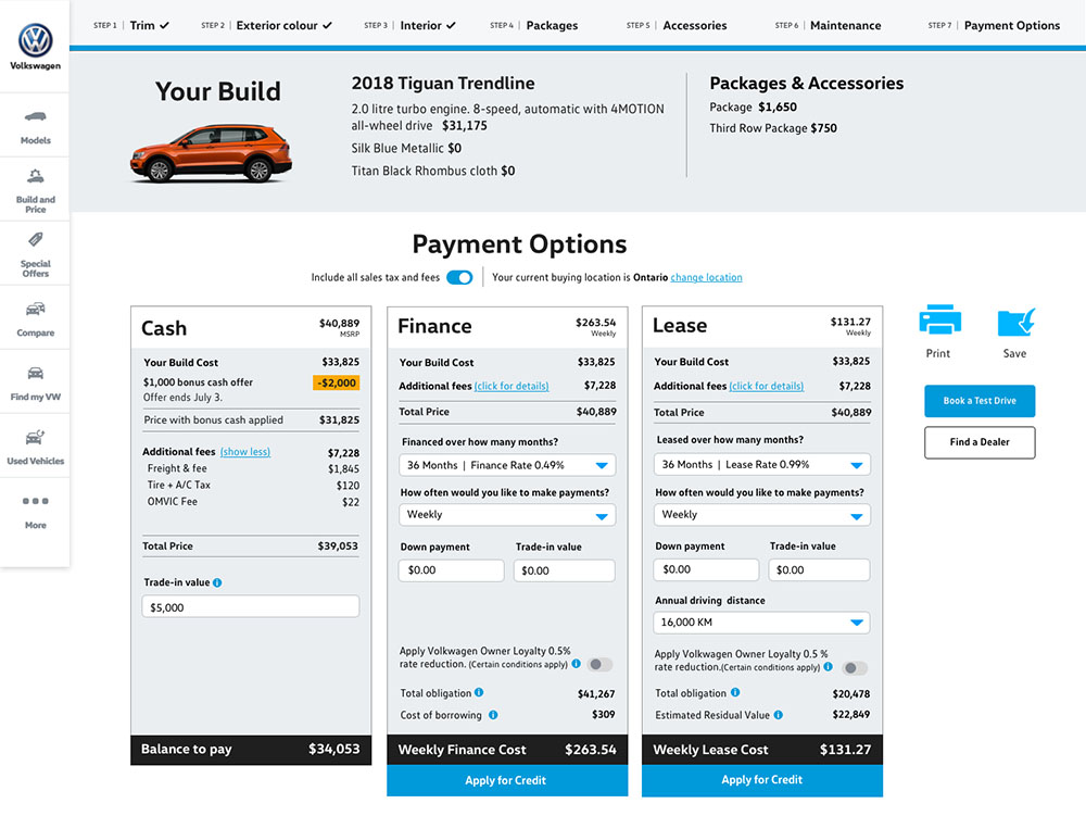
Summary of the vehicle and add-ons that the user had created, with pricing information for cash, finance and lease options.
Sprint 2
For this sprint, we recruited users who indicated they would be most likely to carry out research on a mobile device. I built an interactive prototype of the mobile version which included design and content updates based on feedback from the first usability test.
Click screens for larger version
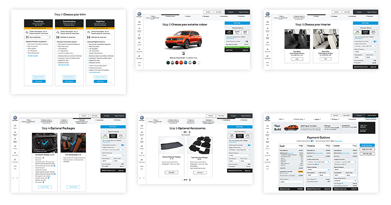
Sprint 3
This sprint involved updating and testing both mobile and desktop prototypes based on feedback from the first two sprints.
Click screens for larger version
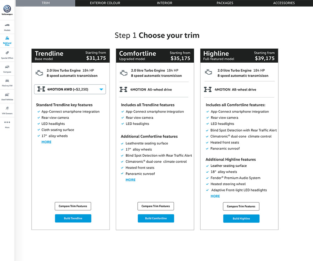
I created multiple versions of the trim cards in the first sprint. The configuration above enables users to most easily determine which version they wanted to build.
The initial design in sprint one contained the financial details in a black bar along the top of the page. Many users did not notice the information. I moved the content to a box, vertically centred on the right of the page.
Users intuitively understood the card presentation and found it easy to compare options, therefore I felt there was no need to update the design.
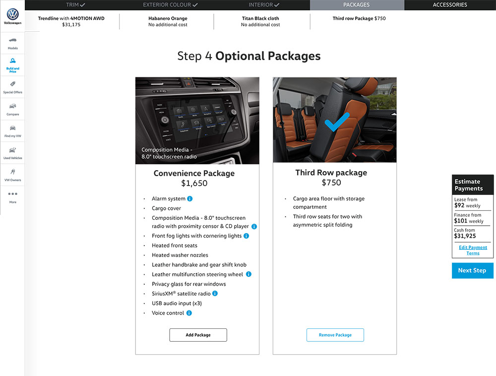
In previous sprints, this step was titled “Add Packages”. I observed some uncertainty from some users, who were unsure whether adding a package was mandatory. Changing the title to “Optional Packages” cleared up this confusion.
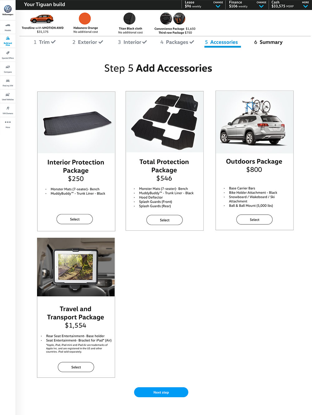
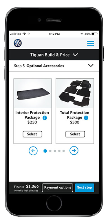
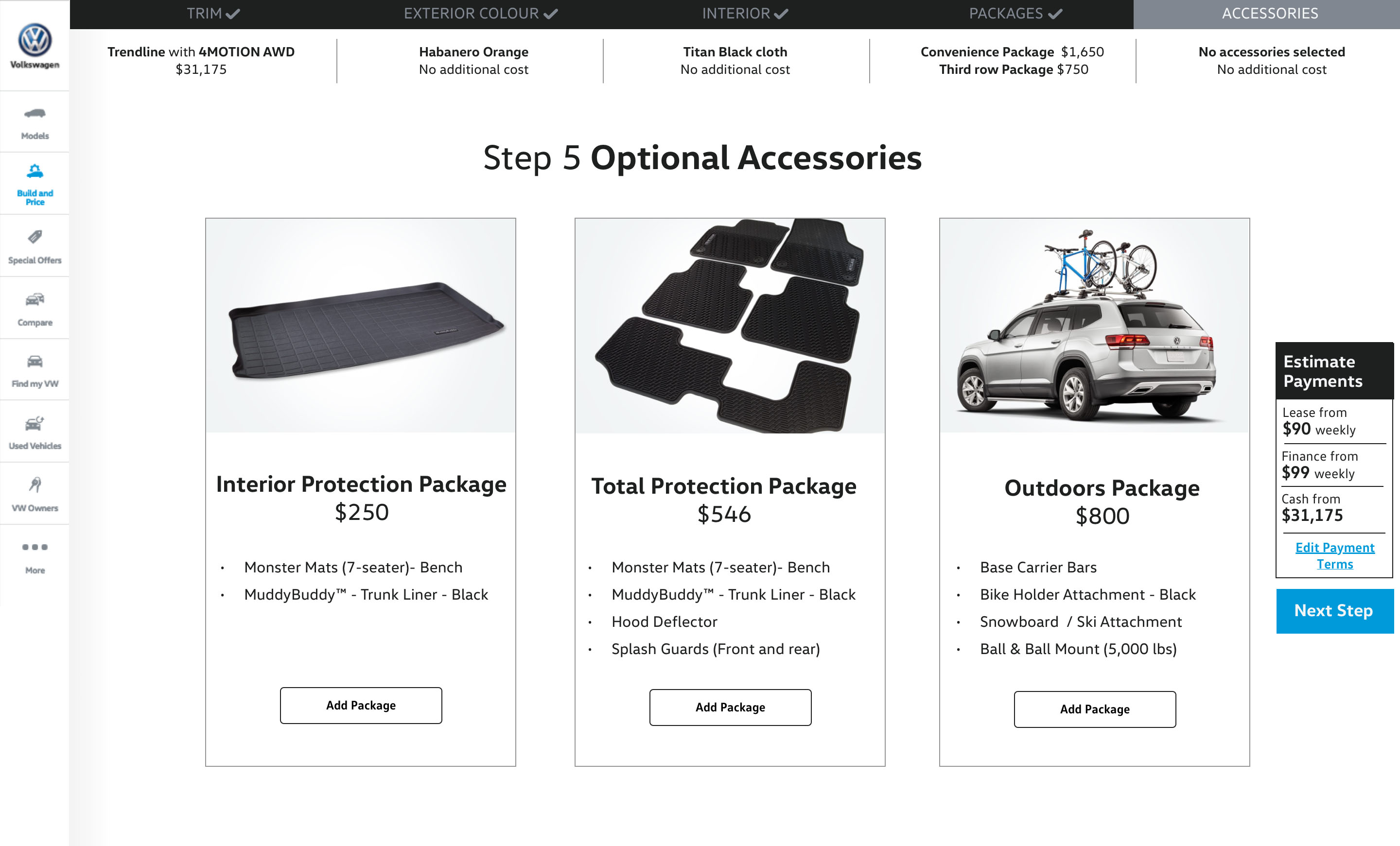
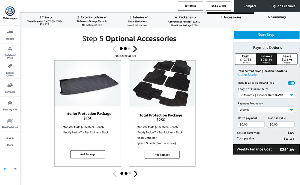
In sprint one, I'd displayed all the cards, using stacked multiple rows. Some users appeared overwhelmed by the number of options and found it hard to scan. In this version, I tried a scrolling carousel to which users responded more positively.
Previous designs of the payment calculator concealed different options behind tabs. In this iteration I wanted to expose the three options - cash, finance and lease, to enable the user to easily compare terms.
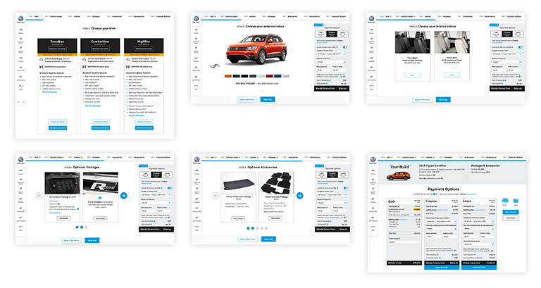
Sprint 4
By this point, I'm trying to work out some of the finer details like microcopy and interface icon. I also tested the tablet breakpoint at this stage.
Click screens for larger version
Small microcopy updates can make a big difference to user comprehension. Changing “More” to “See trim overview” explained the value propositions and encouraged exploration.
While users liked being able to view the financial information on each page, few noticed the option to “Edit Payment Terms” in the box's closed state. For this sprint, I expanded the box as the default state in an attempt to communicate the affordance.
Another small microcopy change. Adding “No additional cost’ to the seating option, cleared up uncertainty for some users who were concerned that their selection might increase the cost.
Cards tested well and are unchanged from previous sprints.
I added circles to indicate the number of additional options when they don't all fit in the window.
I wanted it to be easy to compare payment options. In the previous sprint, I included the build detail in the cash option which some users did not find intuitive. In this version, I moved the build information to span all the columns along the top of the page.
Sprint 5
This was the last opportunity to get the designs before users. There were lots of small iterative updates to optimize the experience.
I added a “shortcut” CTA to the top of the tile to enable the user to make their selection without having to scroll to the bottom. This is particularly useful in the mobile experience.
The “Next Step” CTA above the finance calculator was not always immediately noticed in the last sprint. I moved them to be sticky at the bottom of the viewport, along with a ghost button for “Contact a dealer” which was a business KPI.
Cards tested well. I added a toggle on the finance calculator to minimize it and create more space for those on smaller screens.
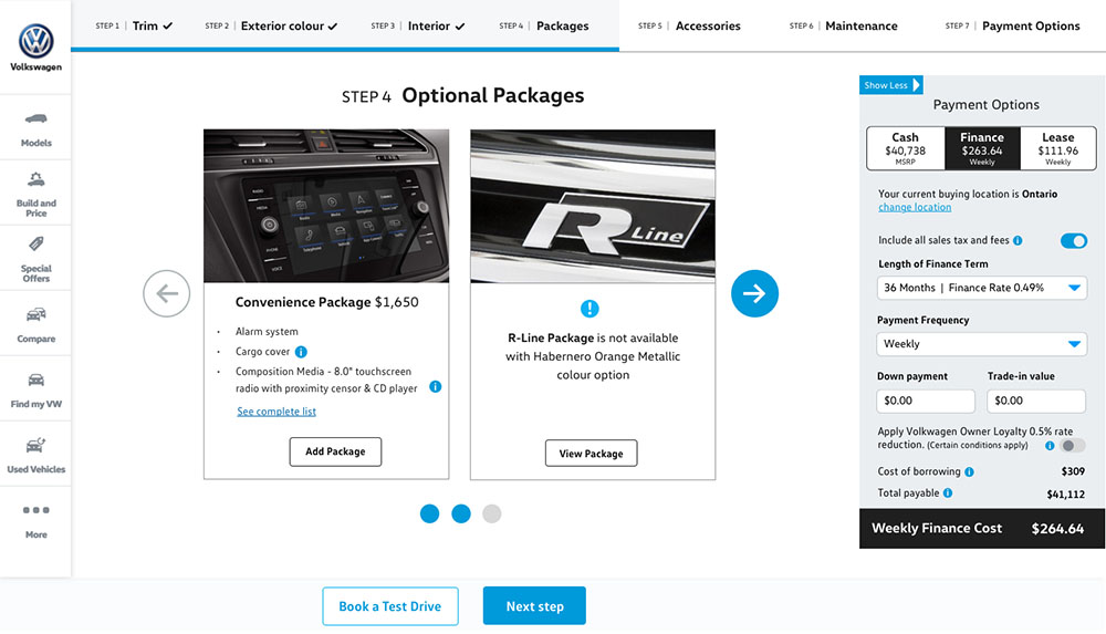
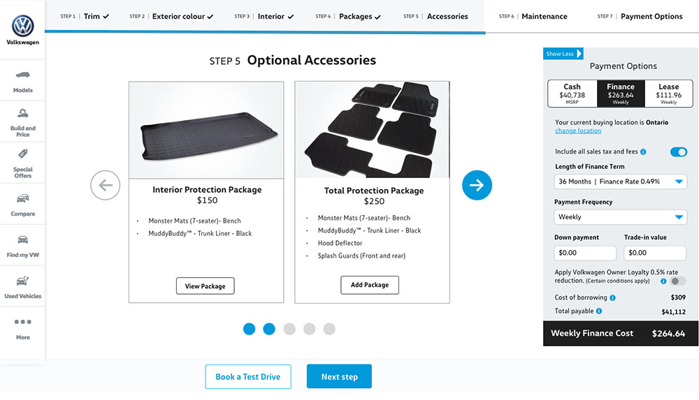
Updated navigation to indicate there are additional cards.
Minor navigation updates as in the previous screen.
Some small content and layout tweaks were made to reflect user feedback.
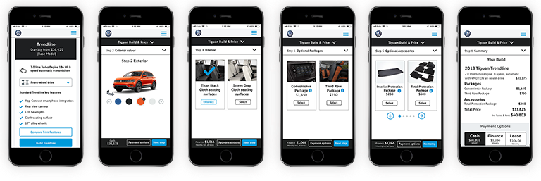
Mobile Content Starts Here
Sprint 1
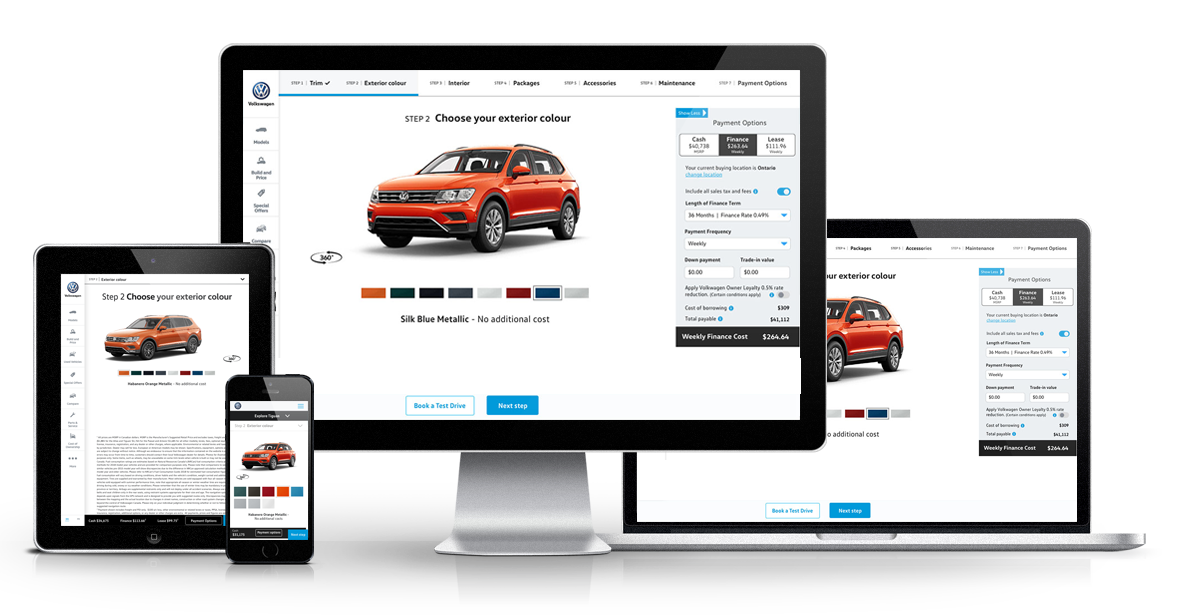
The images below show desktop screens for the six steps in the build and price process. They start with selecting a trim level moving on to colour and feature customization and ending with a summary of the different payment options. At the end of the first week, I created an interactive prototype and spent a day testing with users.
Sprint 2
For this sprint, we recruited users who indicated they would be most likely to carry out research on a mobile device. I built an interactive prototype of the mobile version which included design and content updates based on feedback from the first usability test.
Sprint 3
Design iterations made during this sprint:
- Many users did not notice the financial information in the black bar at the top of the page in the initial design, so I moved the content to a box, vertically centred on the right of the page.
- Step Four was titled “Add Packages”. I observed some uncertainty from some users, who were unsure whether adding a package was mandatory. Changing the title to “Optional Packages” cleared up this confusion.
- Step Five used to have multiple rows of cards, this overwhelmed some user. I updated to a scrolling carousel to which users preferred.
- Previous designs of the payment calculator concealed different options behind tabs. In this iteration I wanted to expose the three options - cash, finance and lease, to enable the user to easily compare terms.
Sprint 4
This was the last opportunity to get the designs before users. There were lots of small iterative updates to optimize the experience.
- Small microcopy updates can make a big difference to user comprehension. Changing “More” to “See trim overview” explained the value propositions and encouraged exploration.
- While users liked being able to view the financial information on each page, few noticed the option to “Edit Payment Terms” in the box's closed state. For this sprint, I expanded the box as the default state in an attempt to communicate the affordance.
- Another small microcopy change. Adding “No additional cost’ to the seating option, cleared up uncertainty for some users who were concerned that their selection might increase the cost
- I added circles to indicate the number of additional options when they don't all fit in the window.
- I wanted it to be easy to compare payment options. In the previous sprint, I included the build detail in the cash option which some users did not find intuitive. In this version, I moved the build information to span all the columns along the top of the page.
Sprint 5
By this point, I'm trying to work out some of the finer details like microcopy and interface icon. I also tested the tablet breakpoint at this stage. Design iterations made during this sprint:
- I added a “shortcut” CTA to the top of the tile to enable the user to make their selection without having to scroll to the bottom. This is particularly useful in the mobile experience.
- The “Next Step” CTA above the finance calculator was not always immediately noticed in the last sprint. I moved them to be sticky at the bottom of the viewport, along with a ghost button for “Contact a dealer” which was a business KPI.
- Updated navigation to indicate there are additional cards.
NEXT PROJECT
Tridel Website Redesign