Tridel Website Redesign
What
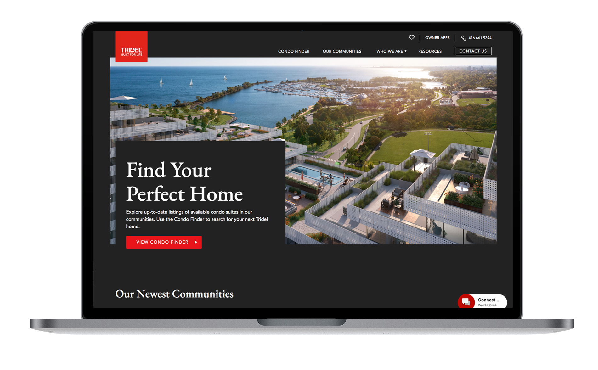
Redesign of Tridel condominium master brand site and creation of modular design system to facilitate the design of microsites for individual condo properties
When
Winter 2021/22
My Role
UX lead
The Team
Ivana Musich VP Products & Platforms
Radek Zajkowski VP Technology
Petra Simpson Project Manager
Colin McCullough, Lead Developer
Christian Steffan UI Designer
Shivangi Patel UX Designer
Lara Tutton Analytics Lead
Camilo Moreno Account Supervisor
Challenge
Tridel's website had undergone multiple iterations, resulting in a lack of focus and coherence. The site's architecture was confusing, and it underperformed as a lead generation tool. In addition, the creation of microsites for individual condo projects required custom coding by external agencies, which was both costly and time-consuming. This approach resulted in competing design patterns and a fragmented user experience.
Process
We conducted a robust discovery phase that involved stakeholder interviews, analytics review, content audit, and usability testing of current and competitor sites. By doing so, we gained a deep understanding of the problem that needed to be solved, the mental models of buyers, and were able to align with the client on a shared vision.
Outcome
34% Increase in returning users
33% reduced bounce rate
3.5% Increase in pages per session
The design system within the CMS enables Tridel's in-house team to create microsites quickly and cost-effectively
July 2022–October 2022 compared to the same period in 2021
Discovery process
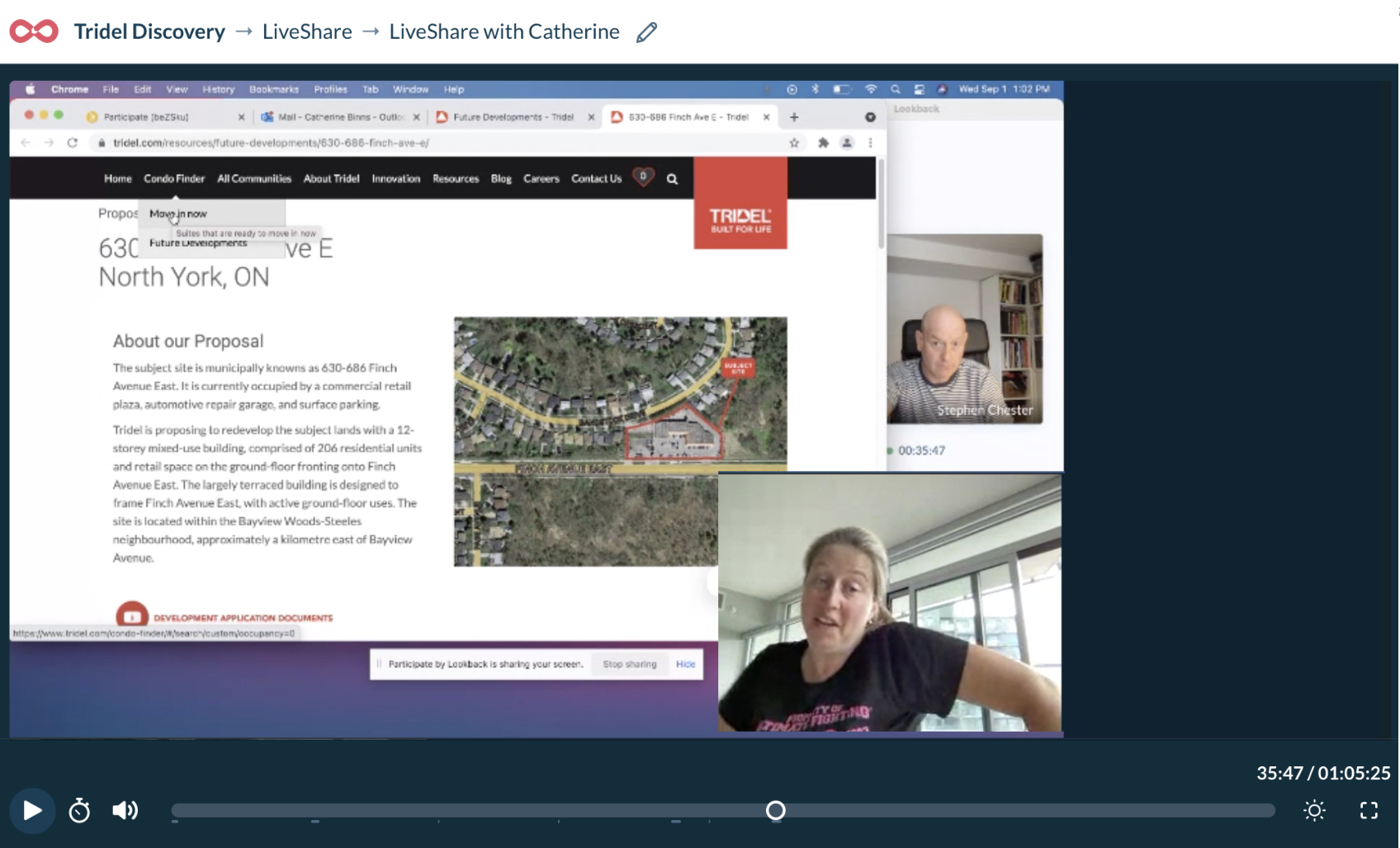
Findings from user research
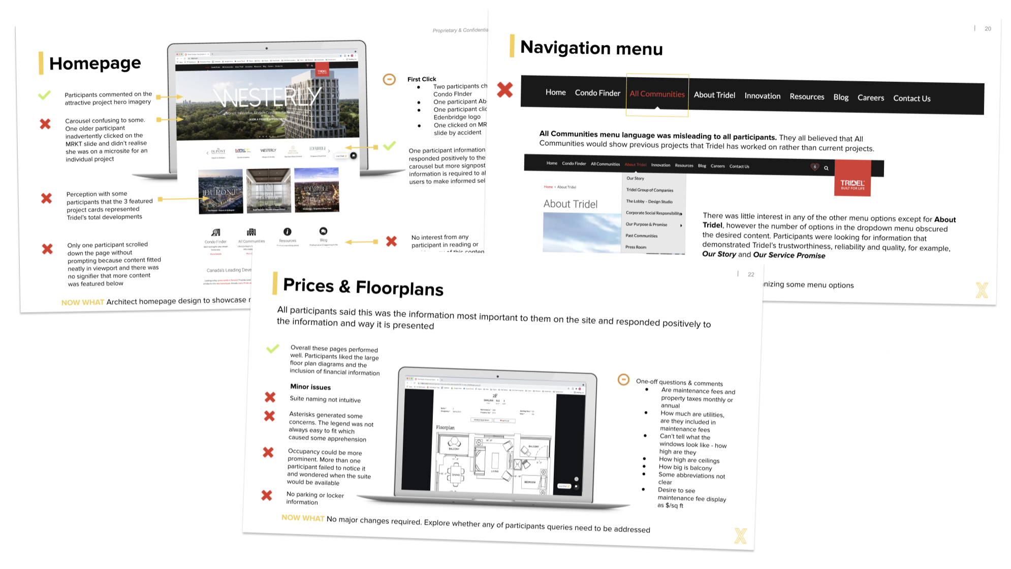
Usability testing
The research sessions provided valuable insights into the journey, goals, pain points, and fears experienced by users when buying a condominium. Usability testing identified the strengths and weaknesses of the current website, along with indications of content and functionality that would provide value to users and encourage them to consider Tridel as their partner.
Participants were given tasks to complete on the existing site to establish how well the content served goal achievement.
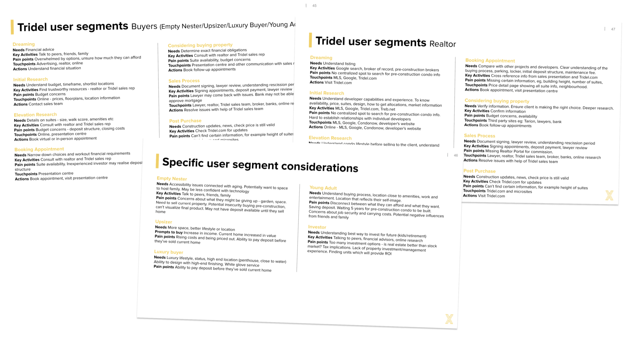
Define condo-buying journey
The research sessions findings enabled us to identify key stages in the condo-buying journey and establish the needs, activities and pain points to determine how the website touchpoint could best serve business and user needs.
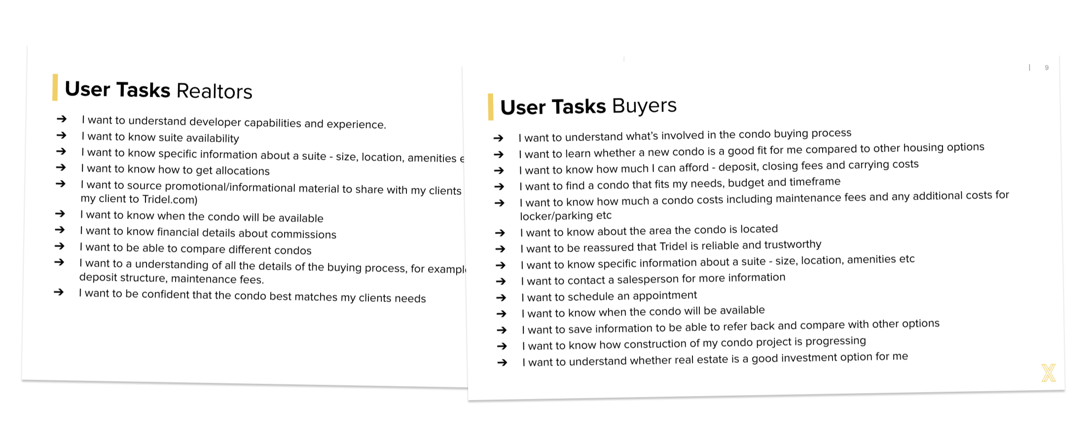
Align on key user tasks
We used the findings to identify all the key tasks that a condo-buyer could be hoping to achieve on the Tidel website. After aligning with the client, these tasks were used as the foundation of the content strategy.
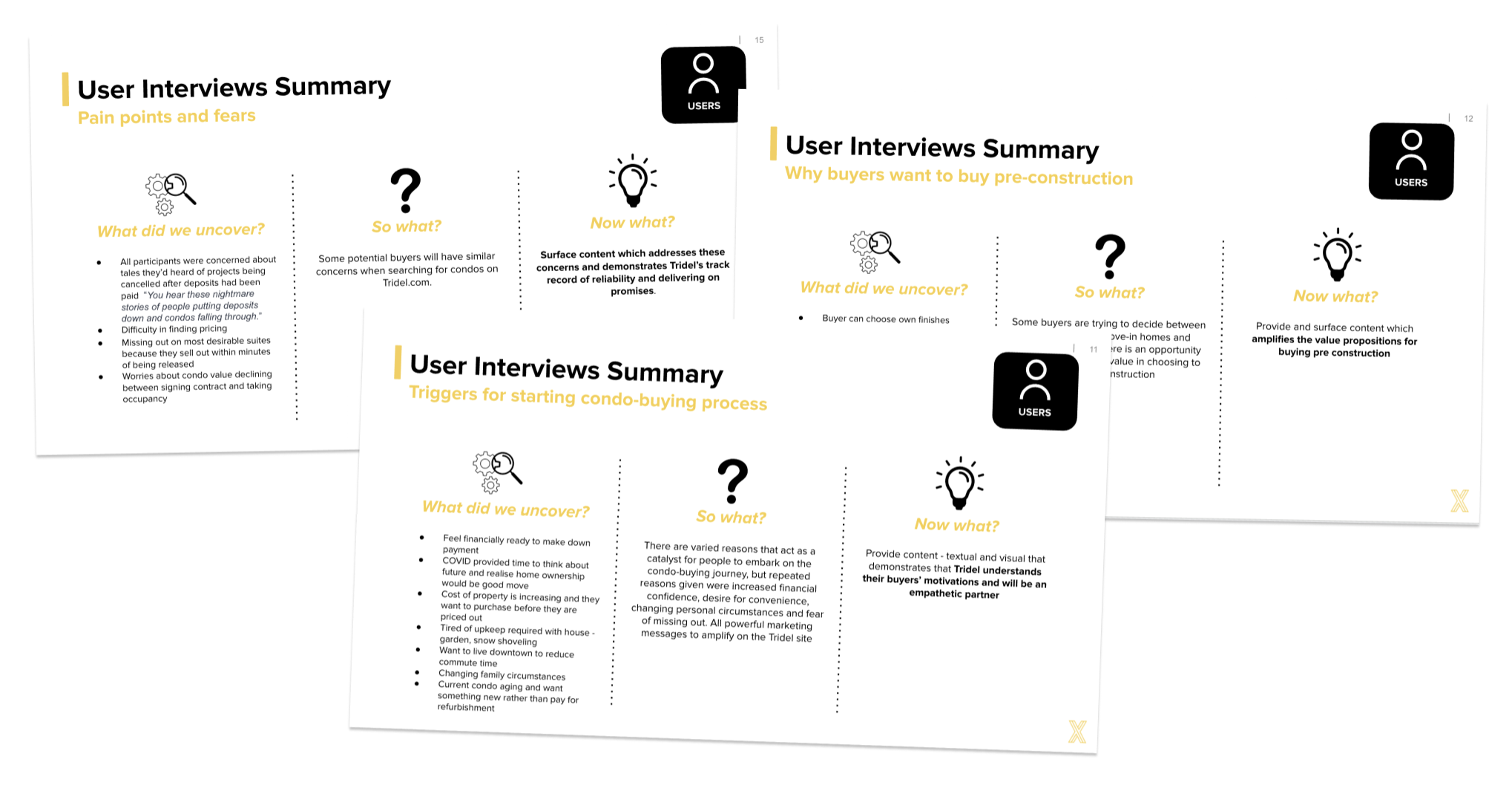
Derive opportunities from mental model insights
Insights into condo-buyers mental models were used to identify areas of opportunity for Tridel to demonstrate expertise, credibility and differentiate itself from competitors.
Analytics Audit
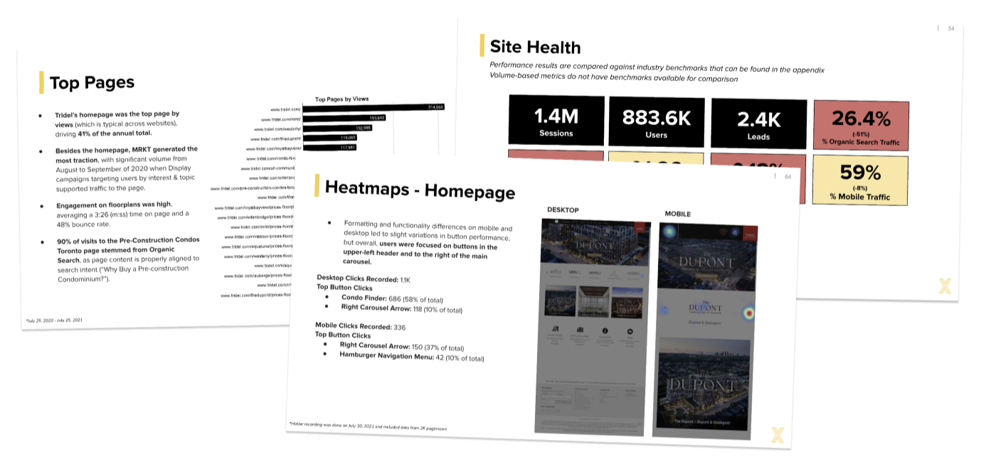
Qualitative findings were triangulated with quantitative insights using Google Analytics and Hotjar to review areas such as channels, page usage, user demographics, leads devices and scroll depth.
Content Workshop
I conducted a remote workshop with marketing, design and technology representatives from the client team to align on content, messaging and strategy while gaining awareness of technical and governance constraints.
Information Architecture
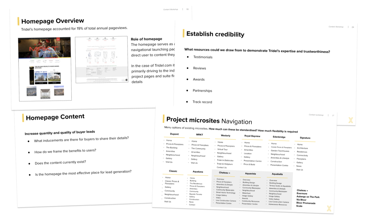
The existing Tridel website structure and navigation presented users with too many options in the top-level menu and did not prioritize the essential information needed during the journey of buying a condominium. The updated architecture was designed to create a user-centric system structured around tasks that deliver the most value to both users and business objectives. We prioritized reducing cognitive load for users by providing a more focused experience.
Component definition and wireframing
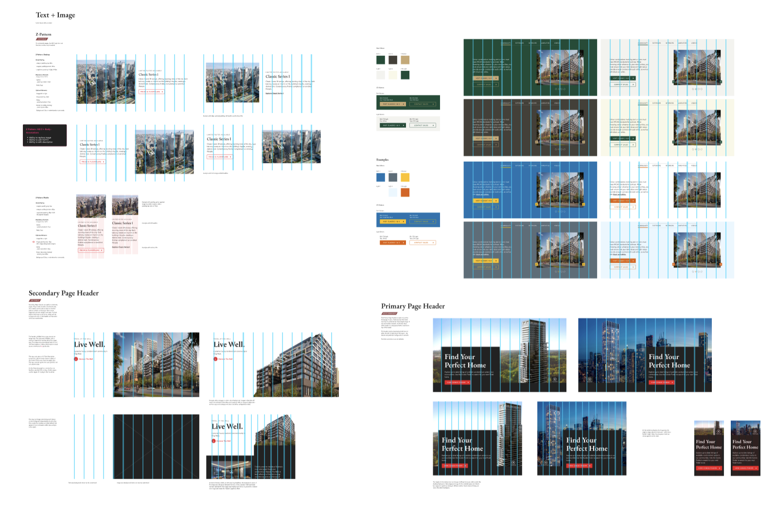
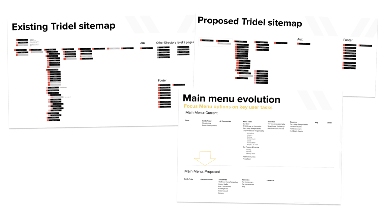
The wireframes creation process followed atomic design principles defining the smallest atom elements to act as building blocks for larger compound components. The site was going to be built using Contentful CMS which limits the number of allowable components which focused us on creating a lean design system based on core repeatable elements with editable variants for increased flexibility.
Sample wireframed components
Microsite requirements
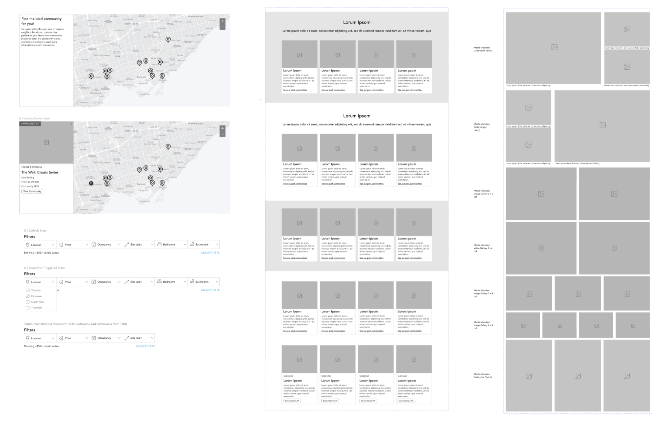
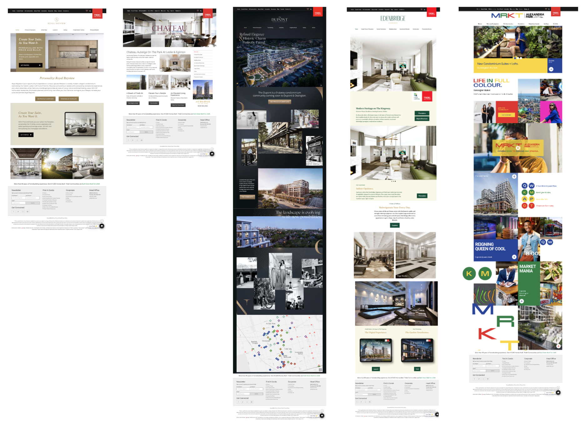
To provide flexibility for Tridel to create microsites for their individual construction projects, we needed to include the necessary components in the design system. Tridel's previous approach was to engage an external agency to custom-code these sites, which proved to be expensive, time-consuming, and inefficient. The design system we created allows sufficient customization of the colour palette, typography, and imagery to differentiate and communicate each project's visual branding. The image below shows a sample of some of the existing microsite homepages. We designed a common library of components and remapped the sites to ensure future scalability.
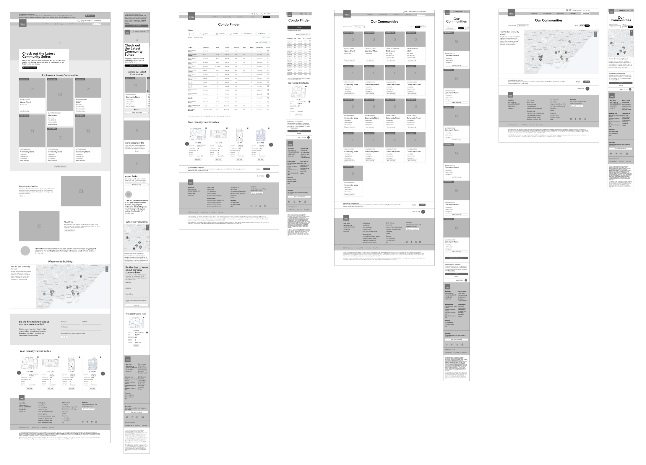
Wireframes for pages built from components
To ensure the client stakeholders were aligned with our solution, key pages were created as wireframes. This enabled us to finetune the content strategy and page flow before committing to time-consuming high fidelity design.
High fidelity design and component library
The UX team worked collaboratively with the UI, content and development teams to build the component library and bring the wireframes to life.
