
Moneris Payment Solutions Website
What
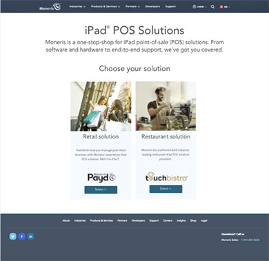
Create microsite driving awareness of Moneris iPad point of sale solutions aimed at restaurants and retail businesses.
When
Spring 2017
My Role
UX research, strategy and product design
The Team
Luke Canning UX Director
Wes Schyngera Project Manager
Andrew Amistad Developer
Matsuko Friedland Developer
Ivana Musich Account Director
John Zachariah Business Analyst
Challenge
Moneris needs to stand out in a crowded market space. They are competing for new business customers attention at a time when the customer is also engaged in such possible tasks as creating menus, hiring staff or choosing a store location. We had less than ten weeks to research, design and release the site, and I was the sole designer/researcher resourced on the project.
Process
Stakeholder interviews to identify business goals. User interviews to determine what the mental model and user goals. Five week-long design sprints with interactive prototype testing and iterative design.
Outcome
Over 30% increase in prospective new customers contacting a Moneris salesperson wanting more information.
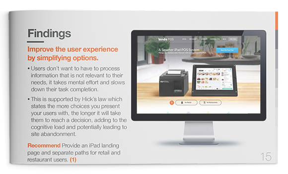
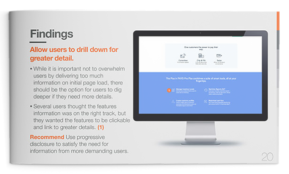
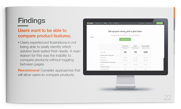
Synthesis of user interviews
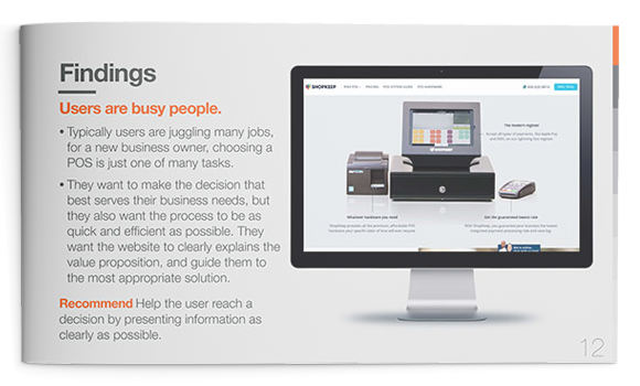
Stakeholder and user interviews were synthesized to reveal patterns and identify opportunities. We discovered that typically prospective point of sale customers are juggling many jobs and choosing a payment system is one of many tasks. They want the website to clearly explain the value proposition and guide them to the most appropriate solution. They are looking for: financial transparency, detailed product features, product images and streamlined experience that delivers only relevant information.
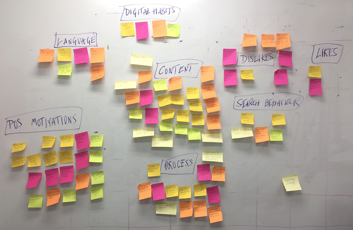
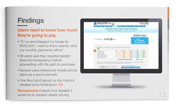
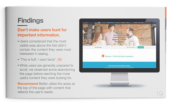
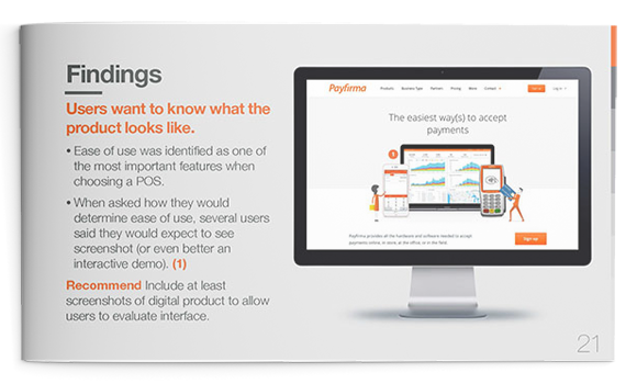
Sample pages from research finding presentation
Design Sprints
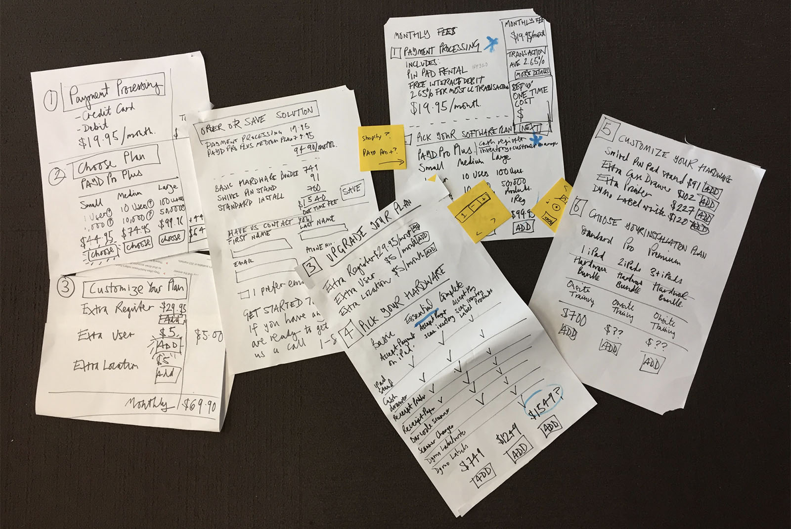
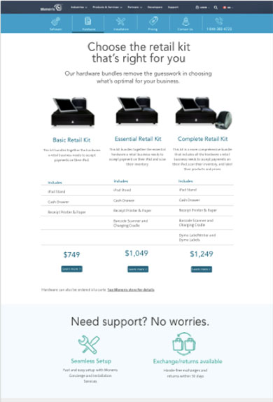
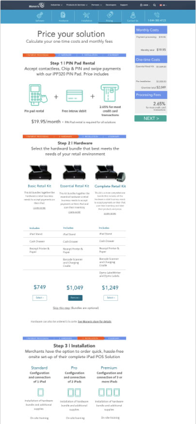
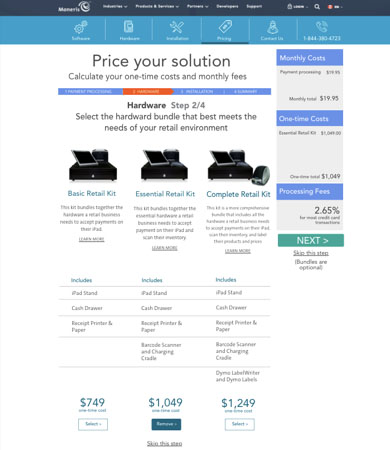
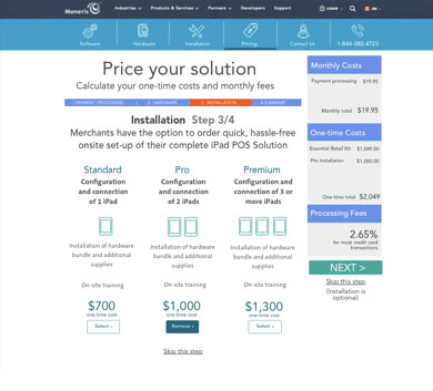
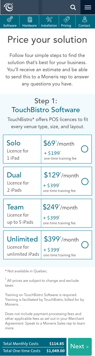
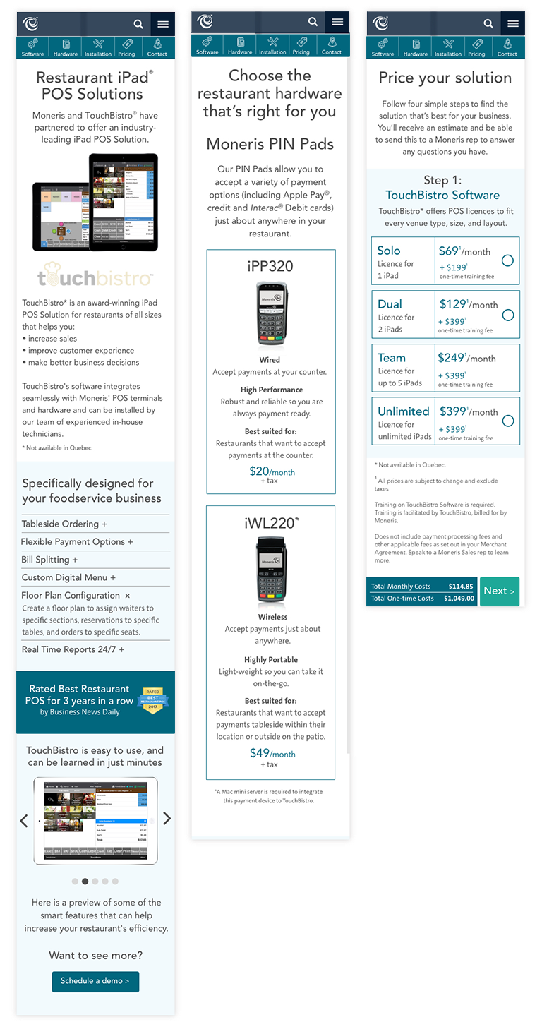
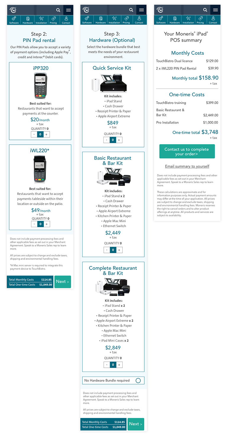
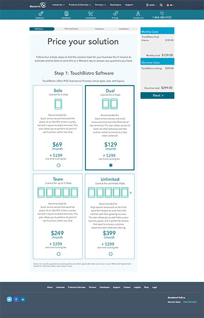
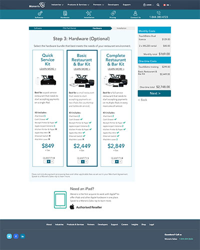
The design phase of the project was broken into five week-long design sprints. Every week an interactive prototype was shown to five users to gain feedback, insights and inform the direction of the following sprint. To allow users to create and price a customized payment solution, I sketched out a user flow that would enable the building of a modular system.
Sprint One
Our discovery research had shown that the most important goal for a user was to determine how much their prospective payment system would cost. To help them achieve this I sketched out a user flow that would enable the building of a modular system. When I was happy with the solution, I took the design into Sketch to build an interactive prototype. Moneris had an existing visual design style guide which I followed for colour, font and grid specifications.
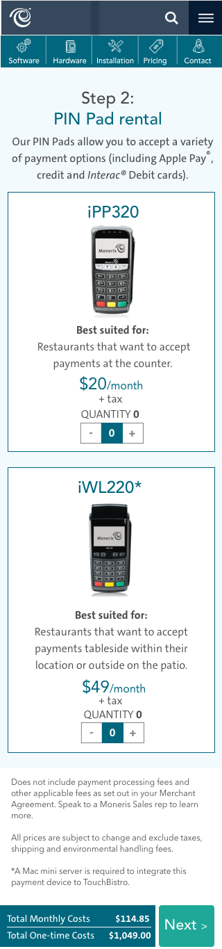
Sprint Two
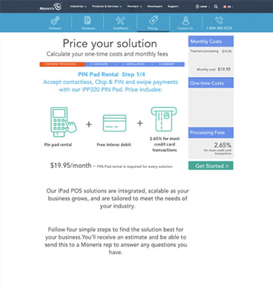
I focused on the build and price tool for this sprint. The first sprint prototype testing suggested users would prefer the process to be broken into multiple pages instead of containing all the options on one page which some found confusing.
Sprint Three
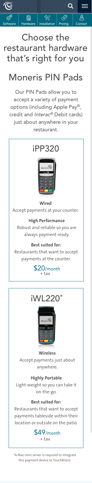
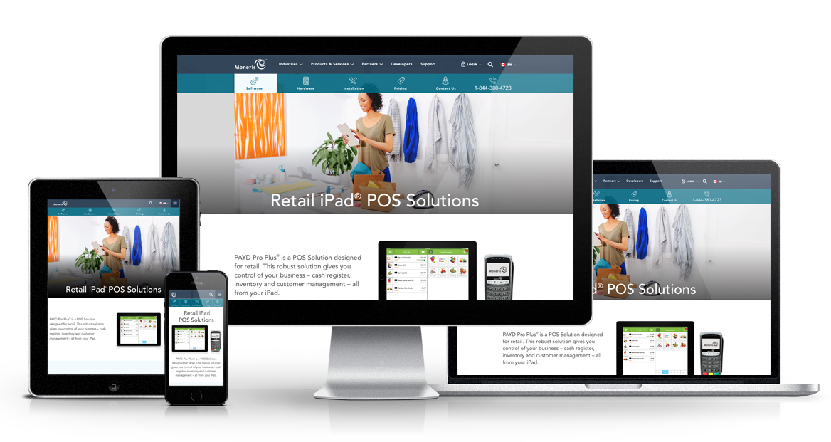
I usually design mobile-first, but for this project, 90% of the people we interviewed said they would prefer to use a desktop device when researching. With findings from the desktop tests in mind, I concentrated on the mobile experience for this sprint. At this stage, I decided to implement a card-based design pattern.
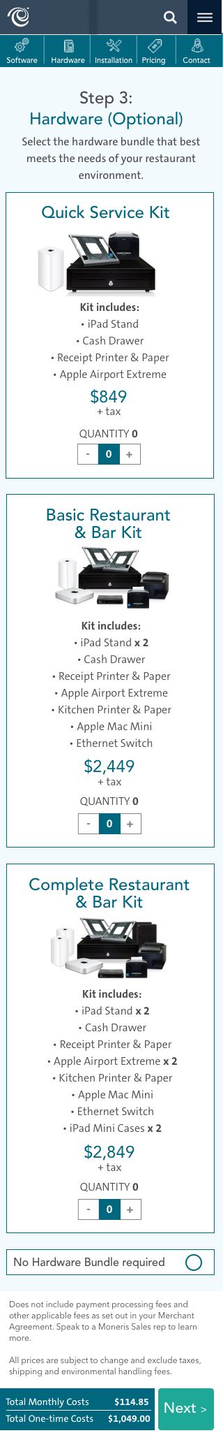
Sprint Three
I usually design mobile-first, but for this project, 90% of the people we interviewed said they would prefer to use a desktop device when researching. With findings from the desktop tests in mind, I concentrated on the mobile experience for this sprint. At this stage, I decided to implement a card-based design pattern.
Sprint Four
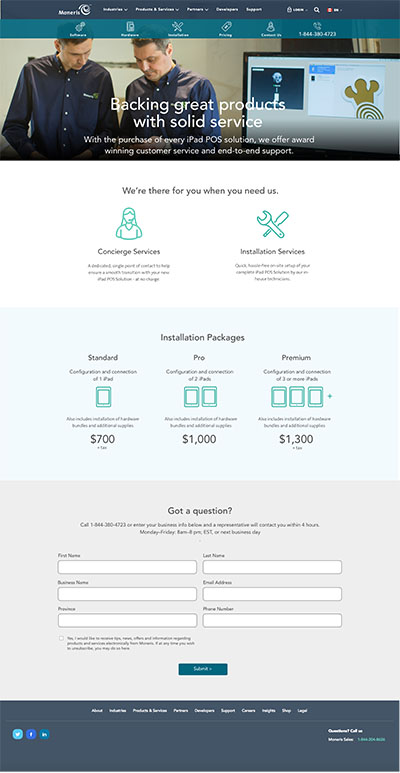
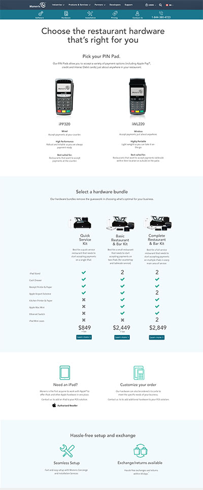
The mobile design card design tested well with users, so for this sprint, I scaled the card-based design patterns to tablet and desktop breakpoints. Visual design updates were made based on client feedback.
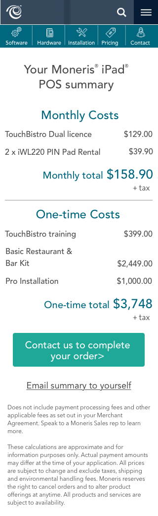
Sprint 5
The usability tests for the previous four sprints had been carried out on prototypes I built using Sketch, Flinto and Invision. For the final testing session, the development team worked hard to build the design using HTML, CSS and JS. This enabled us to test all breakpoints on multiple devices and allow the users freedom to click on whatever they wanted and not be constrained by the more limited options that an Invision prototype allows,
NEXT PROJECT
GO Transit Website Redesign